asofrightnow.com
The Project
Websites for bands are fun to make, but PNW bands in particular carry a certain rough aesthetic that I personally enjoy.
In addition to the site design, my responsibilities included a new logo, a short silent video, and a little photography.
The Client
This site was originally part of the final for my web design degree. It was required that the site be a real website built on a CMS that the client could edit themselves. The client in this case was the band As Of Right Now, A garage band from the Puget Sound region of the Pacific Northwest. The users of this site were expected to be fans and parties interested in booking the band.
The Logo

I designed the band logos—and consequently, the band’s album art, t-shirt design, and stickers—using Illustrator. DJ, the lead singer, just said that he wanted the letters to be “stabbing each other”. Easy enough.
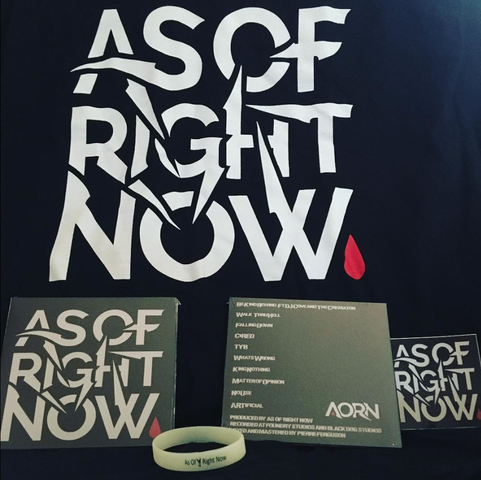
I added the red drop to have a point of interest that could persist through the lettering and make the logotype into an actual logo in all arrangements.

Photos and Video
I started by meeting the band in their practice space, had them practice a song for a bit (it was loud), and I took some photos and short video clips with my phone. Then we went to the back yard to get some quick profile photos with an old Nikon DSLR. I arranged the band photos by shooting outdoors and asking each member (except one) to avoid looking at the camera. I’m grateful every day for autofocus. I also took a few photos at one of the band’s live performances.
The Website
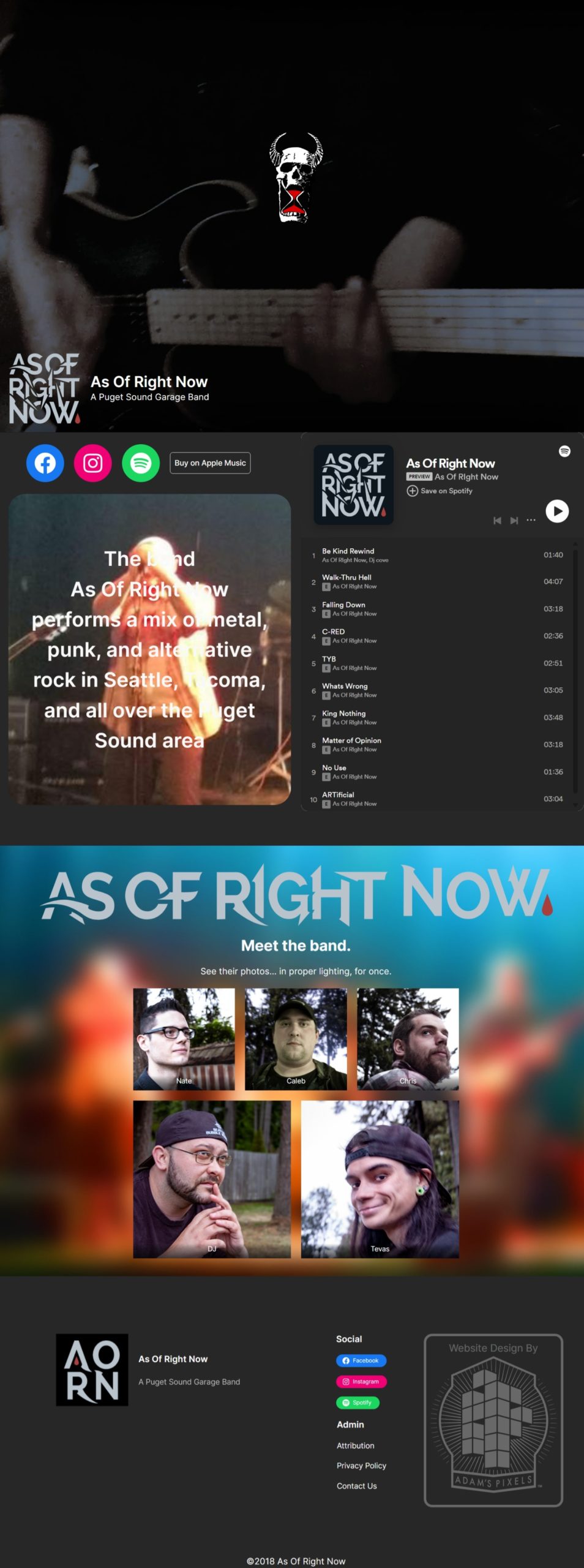
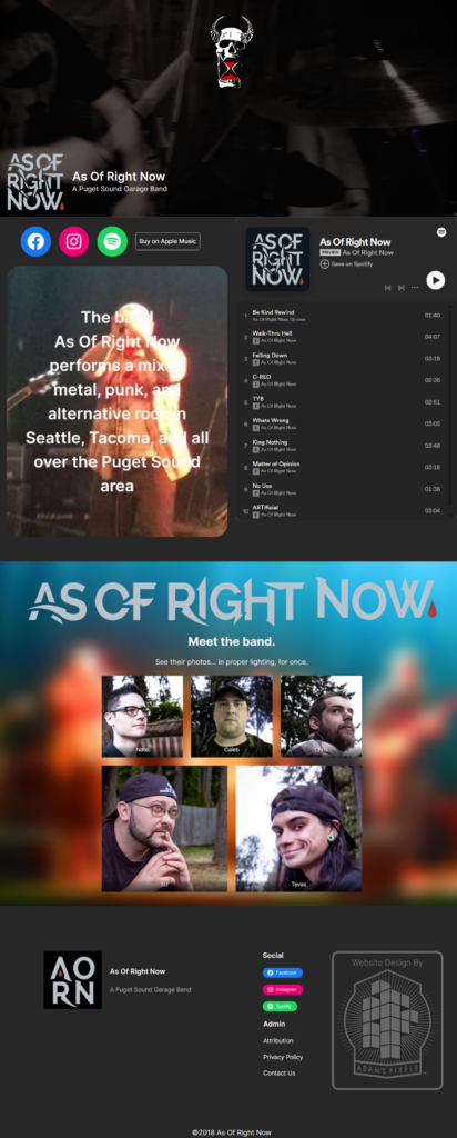
After collecting the above source material, I got to work on the site. A site of this nature is often most effective if treated almost like a postcard. What the user of the site really needs is access to the material service (music), some identifying features (logos, photos, etc.), maybe an opportunity to access services or purchase merchandise (no longer exists), and contact info for the band (a contact form). Apart from that, the site needs to be aesthetically interesting and reflect the band’s style.
I wanted the site to feel active right away, but not necessarily loud. We all remember Myspace, right? So I start the experience off with the little piece of art created by one of the band members centered over a video that slowly fills the entire background with movement and energy. The band’s logo is in the lower left corner to inform the user that they are in the right place and to imply that there is more below. Immediately below that, there is a collection of social media icons and the top of the embedded Spotify player. So as soon as possible, the user has access to the service (the music). After that, we get a few photos of the band members, then a footer menu. If there were merchandise, it would appear between these sections.
DJ wanted to avoid receiving spam emails, so I used a contact form on a second page to give users the opportunity to send a message. The form uses invisible reCAPTCHA v3 and a free SMTP service to make sure that only the messages he wants to receive actually get through.
The future
The band has broken up since making this site, but there’s no way I’m letting go of this URL. For now, this site sits on my server, free of charge to the band, with the possibility that DJ starts up a new project or some news group offers me a million dollars for the URL.
Screen Captures