primaryattribute.com
The Project
A logo, website, and trade dress for a podcast. Below, I describe the choices I made while designing the Primary Attribute website and logo.
The Client
In this case, one could consider the team to be the client and the logo was made for them, but the site was made for the audience.
More about the client and audience demographics
The Cast
Currently, my playgroup consists of seven people including myself—and I honestly think of this work as being for them. Without getting too specific, this group looks like this:
- Age Range: ~28-55 (just guessing, I’ve never asked specifically)
- Gender: All
- Primary Access: Mobile (OS agnostic), Desktop/Laptop (IOS, Linux, W10, W11, various browsers)
- Income: Irrelevant
The Audience
While I view my playgroup as my main client, their client—and therefore the people I’m actually making this site for—is their audience. Ultimately, that’s who this site is for. The profile looks like this:
- Age Range: 18-75 (our podcast is marked as “explicit” due to language.
- Gender: All
- Income: $0-$100,000/year
- Occupation: Various jobs and activities with long “absent-minded” periods like driving/commuting, exercise, or art/crafts.
- Primary access: Mobile (OS agnostic), through podcatcher app (Apple Music, Spotify, etc.)
The audience of a typical actual-play podcast has a wide range of ages, backgrounds, and personalities. They often have occupations that require a lot of driving or a lot of time on “autopilot”, or they may spend a lot of time at the gym, which gives them time to listen to this sort of long-form podcast. In all of these cases, they most often (80-85%) use smart phones to stream the podcast from a “podcatcher” (an app designed to collect RSS feeds and podcast data in order to serve those files as streams to the user). Some users (15-20%) listen through other devices like laptops or smart speakers. Of these listeners, some (est. 30%) use an internet browser to listen to the podcast directly through a website.
In addition to the audience description above, listeners to our specific podcast may have a few additional features:
- They may be looking for a show with more social diversity.
- They may be looking for a show with LGBTQ+ representation.
- They may be looking for a podcast with a broader representation of age.
- They may be looking for an actual play podcast that plays a game alternative to Dungeons & Dragons (our podcast uses Castles and Crusades or Mothership).
I should mention that reaching out to these listeners was never part of the plan. We have only used passive word-of mouth and social media advertising to promote this project. Our listener base usually finds us through either a friend or a direct connection to the cast.
The Logo
There would eventually be two logos in use at the same time. We also use the logo as part of the cover for our podcast, and it was used as the basis for the enamel pins we ordered to celebrate our 100th episode.
More about logo requirements
The logo design started with a few questions to the rest of the cast. Most of whom don’t identify as having what they would consider “artistic ability”. The basic input i received was that we wanted bright colors. I also had a general idea as to what our characters in the show would look like. There were a few other factors to consider for this logo.
- Will be used as a podcast cover
- Must be legible at 100px on a smart phone.
- Must contain whole words, not initials.
- Must look right on different podcast platforms.
- As a square
- With rounded corners
- Circular
- Will be used on the website.
- Would be the basis for the site design.
- Determines color
- Determines some site elements
- Determines at least one font
- Font must be web compatible.
- Color must be web compatible.
- Would be the basis for the site design.
- Could be used for merchandise.
- Must use a limited color pallet.
- Must be infinitely scalable (vector).
- Must use printable colors.
- Should have elements that can be broken down into different arrangements (ie: removable background).
More about design process
The first challenge was the logotype. The words “primary” and “attribute” are not short. They would have to be stacked to be remotely legible at 1″, and there were not many obvious opportunities for interplay with the letters. I was not particularly interested in playing with the letterforms anyway, because I was hoping to use the type directly in the website’s logo as an h1 tag. This narrowed down my choices significantly.
To choose the typeface, I searched through Adobe’s font choices. I knew I wanted it to invoke the covers of old RPG books like Dungeons & Dragons. This meant it needed to be a heavy serif font with lots of character. I found a few variations and typed them out along with some bubble and brush style fonts just to have some reasonable comparisons for later.
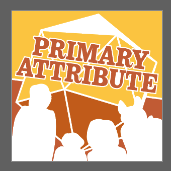
The next thing I worked on was the color pallet. We knew we wanted it to be bright. The First color I chose was a sort of orange. We really didn’t see much orange in the podcast cover space. The next color I chose was yellow. Then a full white. At the time, this was fairly arbitrary. I just knew that the color set would need to be both bright and visible. I assumed I’d be adjusting it later.
Next I needed an element that indicated the nature of this podcast. I looked at the common visual communication used by other actual-play podcasts, and saw lost of symbology. The most common symbols were animals, weapons, and most of all, polyhedral dice—along with references to rolling. I can see why this was a common symbol, and I was interested in using a 20-side die as well, but I felt the detail level on most of these was too high. For my logo, a simple shaded shape would suffice. I used a photo of a d20 and drew linework over it in Illustrator to create my own vector illustration.
Next, I wanted to add some personality, so I literally added visual representations of the player’s personalities. I quickly drew out four silhouettes of different heights to represent the player characters as I knew them at the time. I made the deliberately vague and faceless because I didn’t want to instruct the listener as to how to imagine the players. I didn’t even make it obvious as to whether the figures were looking to or away from the viewer. I wanted to let the listener to fill in the blanks with their imagination, as people are prone to do. The only exception is the silhouette of my character, who has his hood down with his fox ears poking out.
I threw these elements together within a square and a circle to test the overall look, and here’s what I got.
I demo’d these with the cast, and got some helpful feedback about how the design made them feel. The overall concept felt right, but we were looking for better legibility, and they wanted the lettering to be in the positive space. There also wasn’t enough contrast in the colors.
Okay, sure. Let me pop back into the lab and I’ll see what happens.
I adjusted colors with a focus on legibility, changed to a better typeface I found (and tested another), tilted the logotype for a more dynamic effect, applied a thick white outline to the d20, and adjusted the silhouettes a little. Here’s what came out.
That one in the middle was really close. The outlines felt good, so I wanted to do more of those. I also wanted more contrast, and tried a two-tone background again.
And that’s pretty much how it went. I find a good approach to the iterative design process is to offer a few vague ideas in the first volley. This volley is intended to test the main variables and pull the preferences from your client. This will tell you what they really want and where they will give you push-back. You want that push back in stage one, because it turns into impatience later. Also, this project ran the risk of becoming design-by-committee—which I hate doing because it generally leads to no-one being happy—but we mostly managed to avoid that.
The new logo
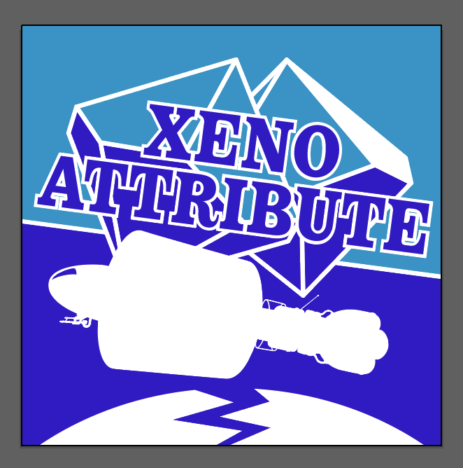
When the first spinoff of the podcast was recorded, I needed to develop a new logo to differentiate the new mini-series, Xeno Attribute. This mini-series uses a different game system based in space and with a different set of dice.
To design this logo, I started by swapping out each element. First, the colors. I basically shifted the hues from orange to blue (not literally, but kinda). They complement the oranges of the other logo nicely. Next, the text. I swapped out “primary” for “xeno”, no biggie. Then there was the tricky bit, the dice. The game used in xeno is Mothership, which almost never uses a D20. Instead it uses a D100 (in practice, this is a pair of 10-sided dice). I took photos of a pair of D10 and illustrated them in Adobe Illustrator and set them behind the text. The last part was the hardest. We don’t expect our characters to last long in this new game, so rather than silhouettes of the player characters, I decided to draw the ship. Took a bit of work and time, but I got there. I added a curved surface with a crack in it beneath the ship to represent the main element of the story line and voila!
The Website
The website, primaryattribute.com, is owned by Ian Brown who gave me permission to do the design work. The site is built on a WordPress CMS framework using a custom child theme and is fully responsive. This site has also been built then rebuilt in order to take advantage of the new features in WordPress.
More details about building in the new WordPress CMS
The original site was built as a child theme of the Podcast theme by ilovewpcom which was designed to work well with podcast producers, however, I felt the base theme lacked flexibility and I found myself working too hard to make certain changes work. That said, the new child theme looks nearly identical to the old one with a few minor improvements, so I’m just going to get into the choices I made during the installation of the new child theme.
The main thing this site is offering is entertainment. The main thing this site is trying to get is subscriptions. My goals are set! The first thing I did was install the TwentyTwentyFour base theme by WprdPress, then create a new child theme, Primary_Attribure_2024. Then I jumped into the FTP and made a new styles folder, then copied over one of the JSON styles folder from the base theme. I renamed it to “attribute”, then changed all the basic information in the file and proceeded to rewrite all the styles. I added support for the Adobe Typekit I use, then moved on to color. This meant that all of the fonts I use from Adobe’s font library would be available through the WordPress customization menus, and I would be able to specify them in the element properties within the stylebook I was now writing. I like this new way of editing the site’s styles because the styles ember themselves deeply into WPs variable CSS attributes. This makes WP set a majority of the defaults for you, so you have much less CSS to write, if any at all.
Other things I adjust include:
- Base font sizes, line height, spacing, etc.
- Font Appearance options for headlines, paragraphs, links, etc.
- The Color Pallet (all of it)
- Turning-on hidden options in the style menu
- and so-on
After all this, I save and push the stylebook, select it in the site, and start fixing bugs (there are always bugs). This handles a large chunk of the styling immediately. After that, create new template parts, starting with the new header and its SVG border. The new site editor makes the creation of reusable elements much faster. I don’t need to dig into the PHP anymore to design the header or add SVGs.
More about solving tricky problems
The first tricky part is the logo. As I mentioned in the logo section above, I intended to use typeface as an h1 as the logotype. However, the logo on the cover is at a tilt and there is no option in the WP system to tilt a headline. I had to start working in the CSS to make the logo container tilt and to add a white border (which I make by using a series of opaque drop shadows). I also had to add the SVG d20 through CSS by using it as the background graphic.
The next tricky part was the navigation menu. The menu is intentionally short on the desktop verion of the website. It also has a redundancy in the dropdown for the “listen” item to make it easy for less familiar users to find that page. On mobile, however, it makes sense to provide more pages at the top level and zero redundancy. WordPress doesn’t help you with this. To get two menus, you have to, well, install two menus, then use CSS to hide one and show the other based on the screen width. Sadly, this basically sidesteps the very convenient (if underwhelming) menu system offered by the block editor. So I did that.
The next bit is the header border. The trick there is to draw the SVG border with a perfectly flat top and sides, and to keep it as skinny as possible. Then you add it to the image block below the header block using the link to the border graphic (after all, it’s an SVG, not a PNG). Set the alignment to align to the top and remove any margin, border, padding, or block spacing that may have been applied. Then you make sure the color of the border fill and the color of the header background are identical and that’s it! I designed this border to look a little rough, like a torn sheet of paper or a stony surface. The footer border is its exact inverse except for the characters in the far right corner. These uneven edges help the site feel more organic and give a little extra breathing room to the content.
After that was the page template. Most of the pages would look best using the same layout—a basic content area with a sidebar. So I created a new template, assigned the new header and footer, and created a sidebar in a stackable second column. That’s the basic design used across most all of the pages.
My favorite bits.
Currently, my favorite feature is Bartholomew. A non-player character in the story who delivers messages, represented here by an animated SVG silhouette. He uses CSS within his own SVG code to animate himself and can be found on the contact page.

The Podcast
I perform as a voice actor (or player) in Primary Attribute and it’s spinoffs.
More about recording a podcast
My friends and I cooked this project up to help us get through the COVID-19 pandemic. It would have been one thing to just play a game with each other online, but why not learn to record and produce a podcast while we’re at it?
Podcasts of this genre are sometimes referred to as “actual-play” because the voice actors can be heard as they are actually playing the game. There are several podcasts out there that already have large dedicated followings such as Critical Role, Dimension 20, and Acquisitions Incorporated. So there were already several examples to draw from. These podcasts are free for all to download and listen to, though often with ads. Primary Attribute is now an actual-play podcast series currently available for free and without ads in most of the places that one could pod a cast.
As a player in Primary Attribute, my goal has always been to be a supportive and occasionally disruptive voice in the story. My character, Vons, is flawed. He’s insecure, frequently prejudiced, wrong, and not the best fighter—but he still saves the day on occasion. He’s also a great problem solver, and focuses on utility and support. This makes him fun to play. The decisions I make as a player are intended to reflect Von’s misplaced values—flawed as they may be.
The real commitment here is in showing up weekly—often in the morning—and finding the enthusiasm to perform as a hyperactive character. Also, trying to be casually funny and do simple math from time to time while maintaining an appropriate distance from the mic.
As of now, Primary Attribute has over 150 episodes posted to the every major podcast distributor through the RSS feed on primaryattribute.com. Our website gets dozens of visits every month, and our podcast gets hundreds of listens each month. Not bad for a COVID project.
Screen Captures