stonelakemassage.com
The Project
Full service design of logos, trade dress, website, and print, plus social media marketing. Below I explain the choices I made while designing the logo, website, and print materials for Stone Lake Massage.
The Client
Kaarin Lysen, owner and operator of Stone Lake Massage
More

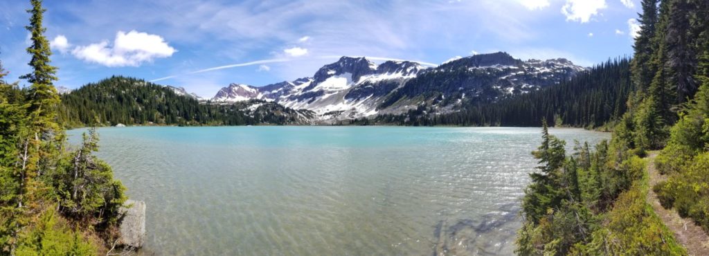
a massage therapist in the Puget Sound area. Her brand is all about physically therapeutic massage, strength, and serenity—evocative of Pacific Northwest mountains and lakes. She also splits her time between travel massage, event massage, and working out of her office.
This project was a donation to Kaarin. When I first met her and saw what she was doing I realized she needed help and basically insisted that she give me the credentials to her original site at kaarinlysen.com. Her site wasn’t terrible, just disorganized and not very useful. After a little poking around and a few discussions about her marketing strategy, we determined that she needed a new site and a new look. That’s where Stone Lake Massage started. As of this article, it’s still getting started, but the branding now feels much more cohesive and the business feels a little more professional.
The Logo
I would eventually create two logo designs.
More
Version 1
It took more than one attempt to make a proper logo for this business. At first Kaarin was set on pulling graphic elements from a photo of a lake she once lived on for a year. It met the criteria for her brand and lent itself to a simple color scheme.
I started with a silhouette of the mountain. I tried adding a lake and other elements. I tried setting this into various shapes and tried working the typography into the elements.

Eventually, I duplicated and flipped the mountain range to make a reflection. I set it in colors extracted from the photo, reversed the name from the mountain and applied a simple font(Trajan), then added the shape element of a curved spine to divide the mountain from it’s reflection. I tried several permutations of the same design to allow it to fit in various places. It passed Kaarin’s standards and was good enough to put on the website for a month and on an order of business cards.
The logo had problems. Its left and right edges were flat and didn’t terminate themselves so the logo either needed to be framed or cut to bleed. It couldn’t stand on its own on the website unless it went all the way from one edge of the screen to the other and it would never work as a letterhead unless it was framed. Most importantly, the text was small. At two inches wide, the font was still too small for me to read in print, and that’s all the reason I needed to redesign this piece as soon as I could.
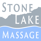
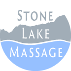
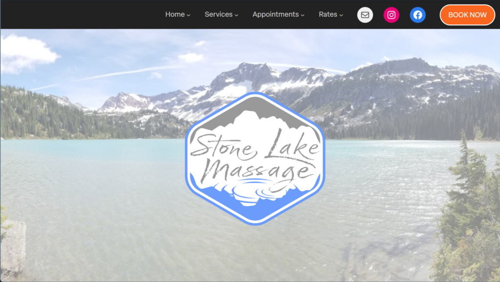
The Logo – Version 2
The next attempt went differently. Kaarin and I had seen the old logo in action on some business cards and brochure designs, and we recognized what worked about it and what didn’t. The new logo would need more of a frame. The lettering needed to be more dominant, and easier to fit into a square or circle. Kaarin also felt the typeface was too formal and strict. The old logo looked a bit like a bank.
This time we were willing to move away from the literal photo of the mountain and into something more stylized. I started by setting the mountain images against various shapes and experimenting with fonts. Kaarin’s favorite was Cherry Blossoms. I still feel it’s a bit too playful and busy for a logo, but it works well enough. Kaarin also wanted the type to be in the positive space. if the text was going to be in the positive space and have all this style to it—first, there wouldn’t be room for the spine-shaped shoreline. Second, the mountain and lake were going to be in the negative space and the frame was going to be what held it all in. After trying a few things, the soft hexagon shape felt most natural. The grey sky would lend it’s color to the mountains below, and the mountain’s reflection would be white in an otherwise blue lake. I tried representing the lake in more graphical ways, but it never really took, so I added ripples instead. From there, it was a matter of simplifying as far as I could go, step-by-step.
It reminds me a little bit of a beer logo. Oh well. The lack of shoreline still bothered me, but the reflection breaking through the sides of the frame seems enough to imply one.
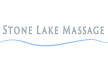
I added a simple offset outline so that the logo could have an optional white background and be used over color. The border went from being an option to being the standard, though the logo still has useful alternate versions, especially the monochrome versions and logotypes. Sometimes I just use the ripples.

The Website
StoneLakeMassage.com grew out of an older site. The evolution was informal and incremental.
More
kaarinlysen.com
When I met her, Kaarin had kaarinlysen.com and was happy with it for a long time. It had everything she needed and it was built on WordPress, so it was easy to add and remove information. However, when I first looked at it, some time had gone by. The theme had aged and photos and other information had been added in a hurry. Now the site felt messy and disorganized. Photos were clumped in batches and the information hierarchy didn’t make sense so it was hard to find what you were looking for. Kaarin said it took too much wrestling to get things where she really wanted them, but the site was good enough. When I first requested access to the backend of her site, I just wanted to fix the photo layout and help her update her pricing, but it grew from there. I felt compelled to adjust everything. One element at a time, when something bothered me I would ask for permission to fix it. Resurfacing the site went itch-by-itch, in this fashion for a while.
What I did wrong
What I should have done is stop everything and start a proper research project, but I hadn’t realized that I would get so carried away. Remaking this site should have included a heuristic study, a user study, a demographic study, competitive analysis, and so-on. We didn’t realize it, but we were looking at a total rebranding effort, and if I had known that from the beginning, I would have stopped everything and started researching.
stonelakemassage.com
Eventually, operating under her own name didn’t make sense for Kaarin. She realized she wanted an LLC, and she didn’t want her name to be limited to her massage practice, so she found a new name and a new URL. Again, I should have started fresh and done some research, but the site felt close to complete. Besides, Kaarin needed it up and running to continue her business. At this point, I just copied the site into the new URL and left it at that.
Picking a name
The process of picking this new URL and business name took some time and discussion. We would talk about the brand design over lunches, dinners, and drinks. Kaarin’s new LLC would require a new brand and new marketing strategy. We began by asking who her new clients would be and where we expected to find them. Kaarin’s target demographic isn’t as simple as “people who want massages”. The target demos should include people who don’t know they need massages, so we discussed Kaarin’s clientele and specializations, and decided that her target demos are perinatal patients, athletes, and people with injuries. Then we asked what these people were seeking, and what they wanted to feel and see when they encountered the brand, and we focused on the elements that overlapped between what the demographics are seeking. We put together a word cloud of sorts, and decided to make “strength and serenity” core to the brand. The message is that Kaarin’s ample physical strength and skill bring about serenity and wellness through therapeutic massage. We needed imagery that reflected that idea. We went online and started typing whatever URLs we could think of that tied these ideas together. We found several reasonable URLs, and finally settled on Stone Lake Massage.
Building a new site
I built the new site on the WordPress CMS framework so that my client could make their own changes and updates in an easy to use environment with a high degree of accessibility features.
Writing content for a personality site
Stone Lake Massage is a business of one, so this site is focused on Kaarin’s personality and skill set. The home page starts with a hero photo to set the tone of natural strength and serenity. Next is a call to action section with a booking button. Booking is the main thing we want visitors to do. If the user doesn’t click the book now button, it’s likely because they either want to know more about the price, availability, or they want to know more about Kaarin herself. To that end, the next thing the home page offers Kaarin’s bio page, because the most important thing to a massage client is to know and trust their massage therapist. To continue building trust, the next pieces of information are testimonials from Google Maps which load through an API. Most of these reviews are about Kaarin directly. Next the page gives basic information about Stone Lake Massage and Kaarin—including her credentials and a quote followed by an FAQ. This part is intended to develop trust by defining the business and offering some quick details. My philosophy about content-based SEO is that a home page should use full-voice written content with focus on search term density, and should link off to relevant pages within it’s home content.
Working in the new WordPress
At first Stone Lake Massage was built on the older version 5-point-something, but while building that site, the new 6.0 came out along with a new theme featuring the new full-site block editor. The child theme for this site includes a specialized JSON-based style book to quickly load presets and turn font and color changes into a one-button process with minimal CSS to apply more specific changes. This is helpful if my client makes too many changes on their own. I’ve also created some useful pre-made patterns and templates to simplify the addition of new pages. This means that my client’s site will be functional and easy to update whether I’m there or not. That said, there’s a lot of freedom in the WordPress system, so there’s a good reason to keep a good designer around.
My favorite detail about most of my websites is the way I use SVG graphics to make sure that the graphics are always sharp, fast, and scale to every size. So far the logo is the only place I’ve used an SVG, though I have plans for more, and I’d like to add some microanimations for buttons and other interactive spots.
Print and Mobile Marketing
If you’ll forgive the pun, Kaarin’s most effective marketing is hands-on.
More
The Farmer’s Market
Massage businesses tend to rely on local clients, so growing a clientele in a new town isn’t easy. Massage often relies on referrals and word-of-mouth. On top of that, Kaarin’s office isn’t exactly in a strip mall, so there wouldn’t be any foot traffic to count on. Adding all of that up, the farmer’s market made a lot of sense. Kaarin already had a folding massage chair, table, and tent, but she didn’t have any of the items she needed to convert visitors to clients.
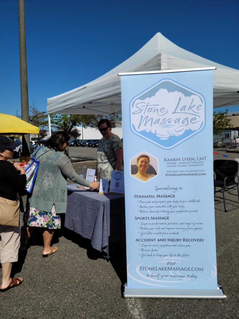
Kaarin needed banners to attract foot traffic, table signs to inform visitors, business cards, and a brochure to give to those who received a chair massage to hopefully convert them into long-term clients. I used Adobe inDesign to design every one of these items.
Social Media
Kaarin has been making use of social media though Facebook and Instagram
More
Recently-ish, Adobe released a product called Adobe Express which allows users to rapidly produce swaths of reasonably good looking social media posts with audio, animation, and video. This system also allows users to schedule out their posts to arrange broad social media campaigns on multiple platforms at once. So far, this system is still young, but I’ve used it to create a holiday campaign for 2024.
Summary
The new site and business name called for a new logo, so I made one. The site needed content, so I wrote some. The site and brochures needed more photos, so I took some—of course I can’t see very well, so these photos weren’t great. The site needed a new color scheme, the form needed adjustment, and so on. All of this work was slow and casual, but over time the site has become more usable, and the Stone Lake Massage brand has become stronger. Kaarin grew a client base three times as fast as she would have without this work, and It’s work I’m proud of.
Screen Captures
Each page is fully responsive
Front Page


Office Info Page
